
14 — Navigation
Five desktop variants, three mobile ones, chosen per site. Only the selected pair is compiled into the stylesheet.
Choosing a variant
Yavi Theme → Navigation → Variants — every setting named in this chapter is on that one page, see 08b — The Navigation page:
| Setting | Values |
|---|---|
| Navigation Art Desktop | MainNavigation · SplitedNavigation · HamburgerNavigation · HamburgerD2 · HamburgerD3 |
| Navigation Art Mobile | BottomSheetNavigation · OrbitFabNavigation · NavigationN4 |
The breakpoint between desktop and mobile is 992px.
The desktop variants
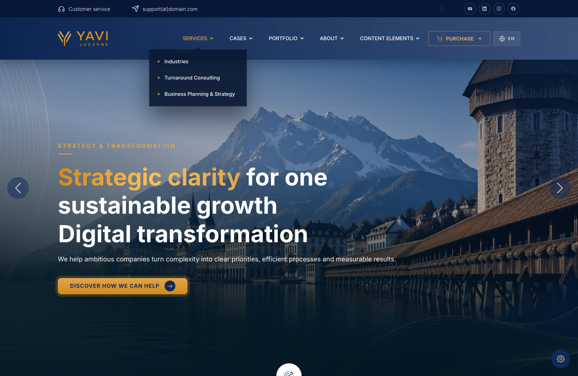
| Variant | Character | Good for |
|---|---|---|
| MainNavigation | Classic bar: logo left, menu right, dropdowns and mega menu | Most business sites |
| SplitedNavigation | Menu split around a centred logo | Brands whose logo is the anchor |
| HamburgerNavigation | Hamburger only, full-screen overlay | Portfolio and campaign sites |
| HamburgerD2 | Hamburger with a typographic stage | Editorial sites |
| HamburgerD3 | Hamburger with an index rail | Sites with few, strong sections |
The mobile variants

| Variant | Character |
|---|---|
| BottomSheetNavigation | A sheet sliding up from the bottom — thumb-friendly |
| OrbitFabNavigation | Floating action button with entries arranged around it |
| NavigationN4 | Split reveal |
Mega menu
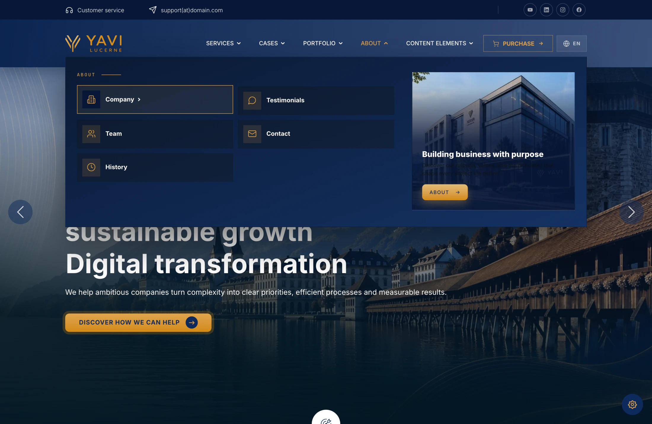
Available in MainNavigation and SplitedNavigation. Per page, in the page properties:
| Field | What it does |
|---|---|
| Megamenu | Turns the mega menu on for this page's subtree |
| Megamenu Columns | Automatic (2, or 3 above 10 entries), 2 or 3 |
| Megamenu Thumbnail | Preview image inside the panel |
| Megamenu Title / Text | Teaser text inside the panel |
| Megamenu Link | The panel's own link |
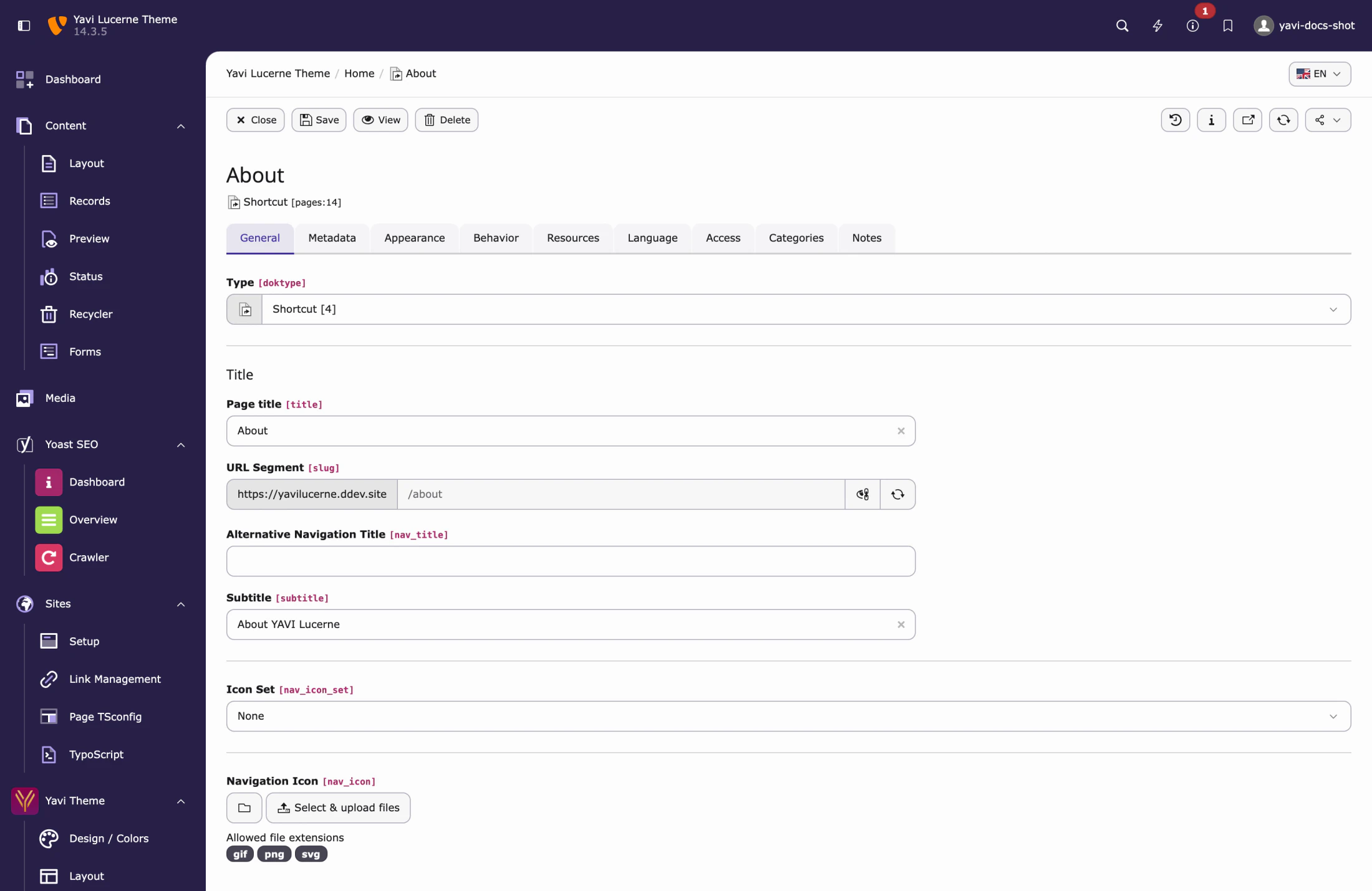
Highlighted menu entry
A page can be shown as a button in the navigation — page properties → Navimenu as Button. Use it for one entry, not five.
Sizes and shapes
Proportions are on Yavi Theme → Navigation → Sizes & rounding:
| Field | Meaning |
|---|---|
| Navbar height | Header height at the top |
| Navbar height (scrolled) | Height after scrolling |
| Dropdown & mega menu rounding | Corners of everything that opens out of the bar |
| Navigation buttons & pills rounding | Corners of the controls in the bar |
Behaviour flags are one tab further left, under Behaviour: fixed header, shrink on scroll, full-width navigation.
The logo heights are the one thing that is not here — they are on Layout → Logo, together with the logo files and the footer sizes.
What travels with the theme
The eight variants live in yavi_core and are imported by an interpolated path (Skin/Navigation/#{$navigationart}). A theme therefore cannot own a variant file — instead it shapes the navigation through:
- Navigation tokens —
--nav-menu-bg,--nav-menu-fg,--nav-link-…,--nav-pill-radius,--nav-panel-radiusand friends. Skin/navigation.scssin the theme, which is loaded after the variant.
That is the seam to use when a theme's dropdown must look different from the variant's default. See 15 — Theming.
Language menu
Multi-language sites get a language pill in the bar with a dropdown, and on mobile a sheet sliding in from the bottom. Its corners follow the same two rounding fields as the rest of the navigation.
Search
Turn it on under Navigation → Language & search and set the Search results page. The theme renders the field and submits by GET; the results page needs a search plugin. Without a target page the request goes to the current page — the quietest possible failure, so set it.