
07 — Design / Colors
25 fields, one page. Everything that gives the site its colour.
Brand colours (8 fields)
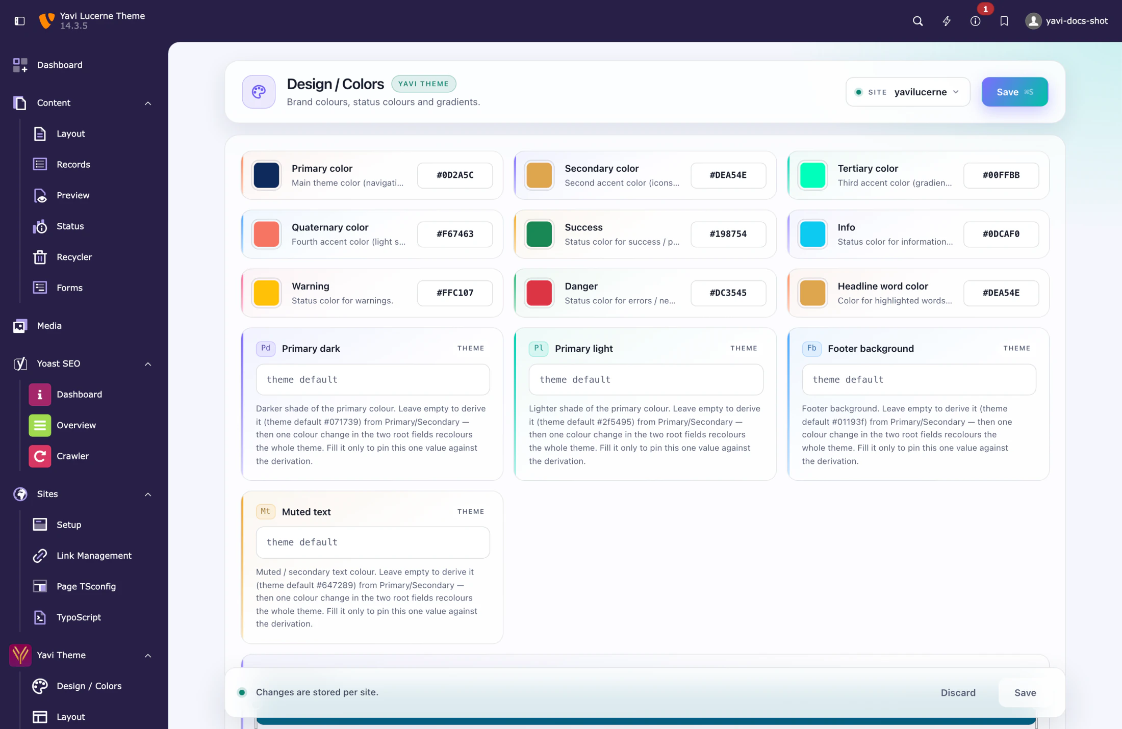
| Field | Where it shows |
|---|---|
| Primary color | Navigation, buttons, accents |
| Secondary color | Icons, links, hover effects |
| Tertiary color | Gradients, buttons |
| Quaternary color | Light secondary / hover tones |
| Success · Info · Warning · Danger | Status colours |
These four brand colours and four status colours are SCSS variables of Bootstrap Package (plugin.bootstrap_package.settings.scss.*), not custom properties. They are compiled into the stylesheet, so a change needs a cache flush to become fully visible.
From the primary colour the theme derives a whole family — lighter and darker variants, gradient stops, the navigation background, hover states. That is why setting one colour usually changes more than you expect: the derivations follow.
Derived tones you can override (4 fields)
| Field | Default behaviour |
|---|---|
| Primary dark | derived from the primary colour |
| Primary light | derived from the primary colour |
| Footer background | derived |
| Muted text | derived |
Leave them empty and they follow the primary colour. Fill one in and it stops following — which is what you want for a footer that must be a specific colour, and what you do not want if you plan to re-brand the site later.
Headline word colour
Headline word color is the colour for words marked inside a headline. Editors mark them by wrapping them in square brackets:
Building business [with purpose]renders "with purpose" in this colour. See 12 — Content elements.
Gradients (12 fields)
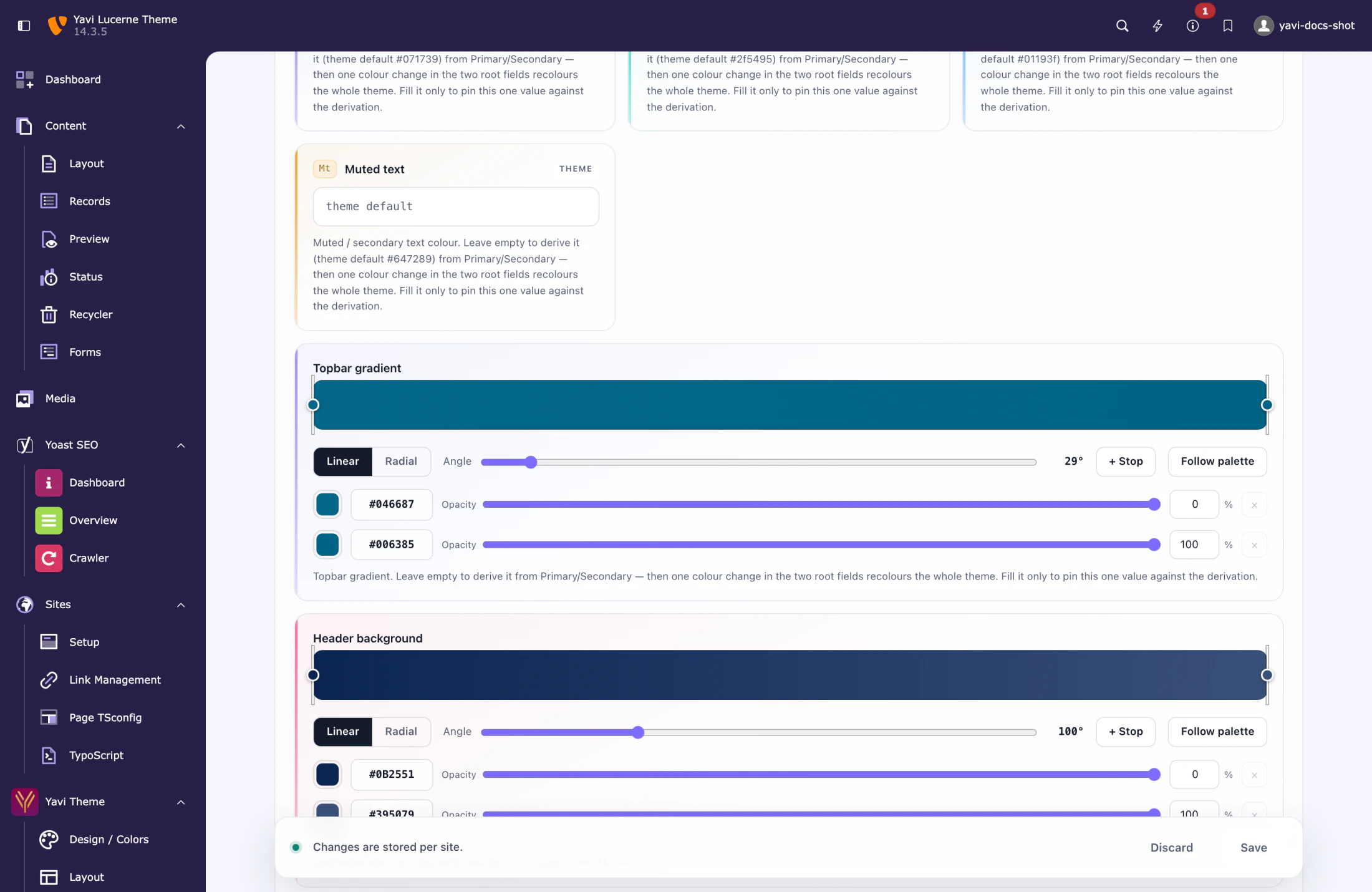
The gradient fields use a visual editor: drag the colour stops, set the angle, add a stop by double-clicking the bar.
| Group | Fields |
|---|---|
| Backgrounds | Primary gradient, Secondary gradient, Topbar gradient, Header background |
| Buttons | Primary / Secondary button gradient, each with a hover variant |
| Headline bands | Header BG (primary), Header BG (secondary) |
| Headline text | Headline gradient (primary), Headline gradient (secondary) |
The one rule for gradients
Once you save a value, that gradient is frozen: changing the primary colour no longer moves it. The editor shows the derived gradient as a preview so you can see what you are about to freeze, and the button Follow palette clears the field to hand it back to the derivation.
This matters most on the Header background. It is derived from the primary colour by default; freeze it and a later colour change leaves the header behind.
Angles
The angle is in degrees, 0–360, exactly as in CSS: 0deg runs bottom to top, 90deg left to right, 180deg top to bottom.
Order of the fields
The page follows a deliberate order: brand colours first, then status colours, then the derived tones, then the gradients grouped by what they paint. Headline word colour sits next to the status colours because it is the same kind of decision — a single word of colour, not a surface.
Practical advice
- Set primary and secondary first, then look at the site. Because so much is derived, changing these two often gets you 80 % of the way.
- Only freeze a gradient when the derivation is genuinely wrong. Every frozen gradient is a place a future re-brand has to remember.
- Flush the cache after changing the brand colours. The custom properties update immediately, the compiled SCSS does not.