
13 — Hero and carousel
Three elements share one slide table:
| Element | Use |
|---|---|
| Carousel Fullscreen | The hero: full viewport height, background image or video |
| Carousel | Normal height, inside the content flow |
| Carousel Small | Compact, e.g. for testimonials |
The carousel on video
The video loads from YouTube only once you press play — nothing is requested before that (why).
Slide types
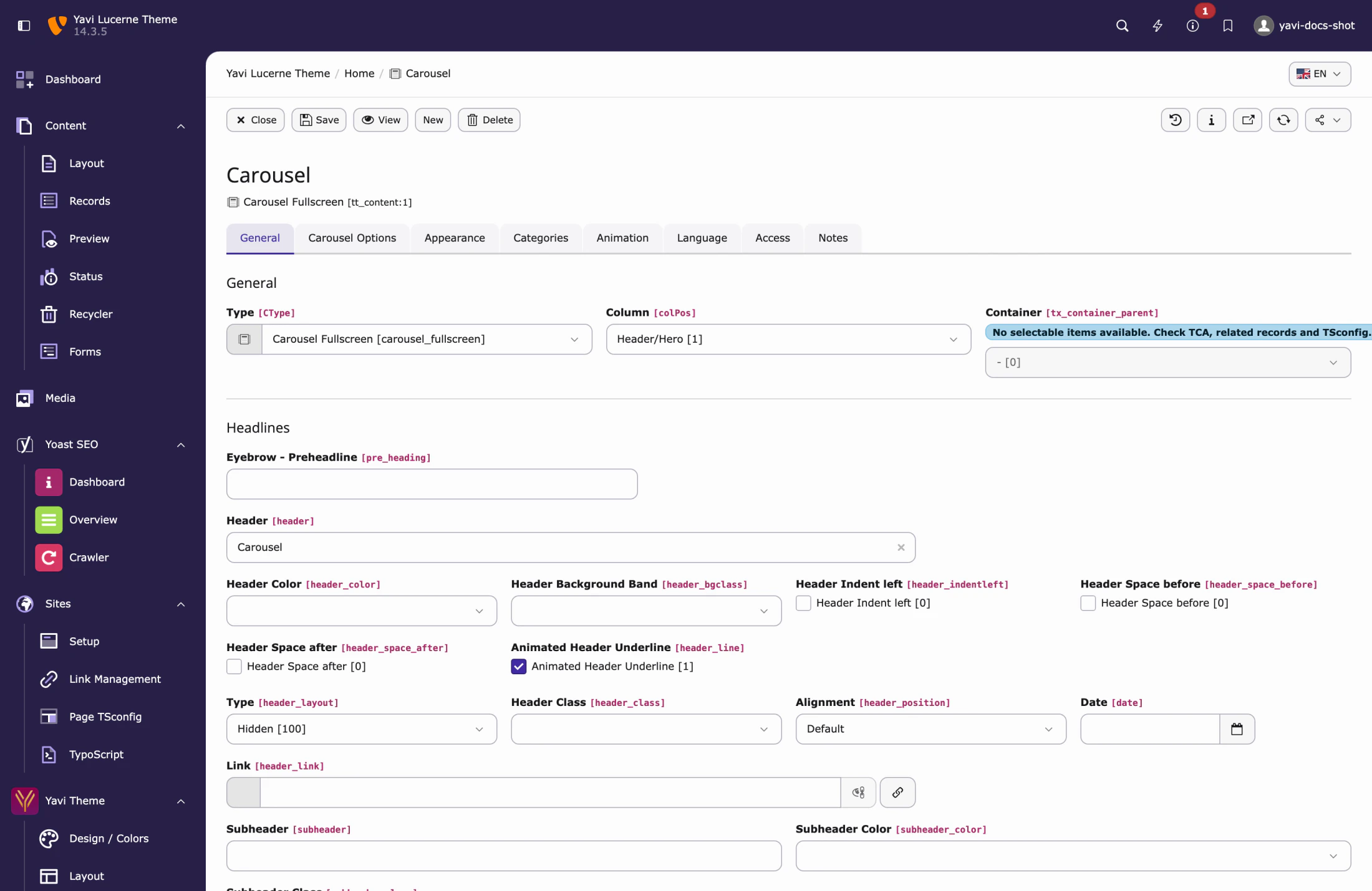
Each slide picks a type, and the type decides which fields it shows:
| Type | Content |
|---|---|
| Text | Headline, text, buttons |
| Call to action | As above plus a prominent button block |
| Image | Image next to the text |
| Text and image | Two columns |
| Background image | Image behind the text |
| Background video | Video behind the text (MP4/WebM plus responsive variants) |
| HTML | Free markup |
| Cards | Cards inside the slide, maintained inline |
| Video | Video as slide content |
The text block of a slide
![Editing a slide: eyebrow, headline with [brackets], rotating phrases with their position and animation](images/backend-carousel-slide.webp)
Editing a slide: eyebrow, headline with [brackets], rotating phrases with their position and animation
| Field | Note |
|---|---|
| Eyebrow – Preheadline | Small line above the headline with its own rule |
| Headline | [Square brackets] colour single words |
| Slick header | Rotating words; separate them with semicolons (;) |
| Slick header position | Above or below the headline |
| Slick animation | Horizontal, vertical or fade |
| Subheadline, text | |
| Text position vertical | Top, centre, bottom |
| Text position horizontal | Left, centre, right — this also moves the eyebrow's rule and the button row |
| Text width | Percentage of the container |
| Button | Link, label, colour |
Background and overlay
| Field | Note |
|---|---|
| Background image | With focus point support: click the point that must stay visible when cropping |
| Background color | |
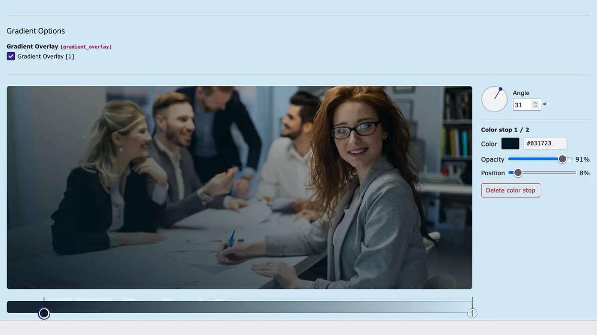
| Gradient overlay | A gradient over the image, edited with the visual gradient editor |
| Text color |
The focus point is stored per file reference, not on the file — the same image can hold a different focus in another slide.
Transitions
| Transition | Effect |
|---|---|
| Ken Burns | Slow zoom in |
| Zoom Fade | Soft zoom out |
| Blur Fade | Focus effect |
| Overlay Fade | Dark to light |
background-attachment: fixed. When a transition is set, the theme emulates the parallax with a viewport-pinned layer in JavaScript instead.Controls
| Field | What it does |
|---|---|
| Show Carousel Control | The arrows left and right |
| Show Carousel Indicators | The position dots |
| Show Topic Control | The topic navigation: one entry per slide with icon and title |
| Item Height | Fixed slide height |
| Autoplay, interval, wrap | Standard Bootstrap carousel behaviour |
Scroll indicator
A slide can offer a scroll-to-content link. Set Scroll to content to the UID of the target element; the button appears at the bottom of the slide.
The icon is the mouse glyph by default. Upload an Icon on the slide and it is used instead — SVGs are embedded so they take the button's colour, other formats are placed as images. The same icon field also feeds the topic control, so one upload serves both.
Hiding slides per viewport
Each slide can be removed on mobile, tablet or desktop. The slide is genuinely removed from the markup and the controls are re-indexed — hiding it with CSS would leave an empty slide in the rotation.
Height of the fullscreen hero
The fullscreen carousel is 100vh by default. Up to 1024px the theme uses 100dvh minus the header height instead, because the mobile browser chrome would otherwise cut the slide.
Practical advice
- One message per slide. The rotating words exist so a single slide can say three things without three slides.
- Compose the animation delays. Eyebrow 800 ms, headline 950 ms, buttons
- 1150 ms reads as one movement.
- **Prefer
fade-overslide-** unless you specifically want the sliding motion: fade starts transparent and moves a fixed 100 px, slide moves the element by its own width. - Background videos need a poster, otherwise the first frame is a grey box until the video is ready.