
08 — Layout
37 fields in seven tabs. Everything about proportion: how large, how far apart, how round.
Almost every field here may be left empty. Empty means "use the theme's value" — and the theme's value is usually the right one. Fill in a field only when this particular site needs to differ.
Tab: Logo (9 fields)
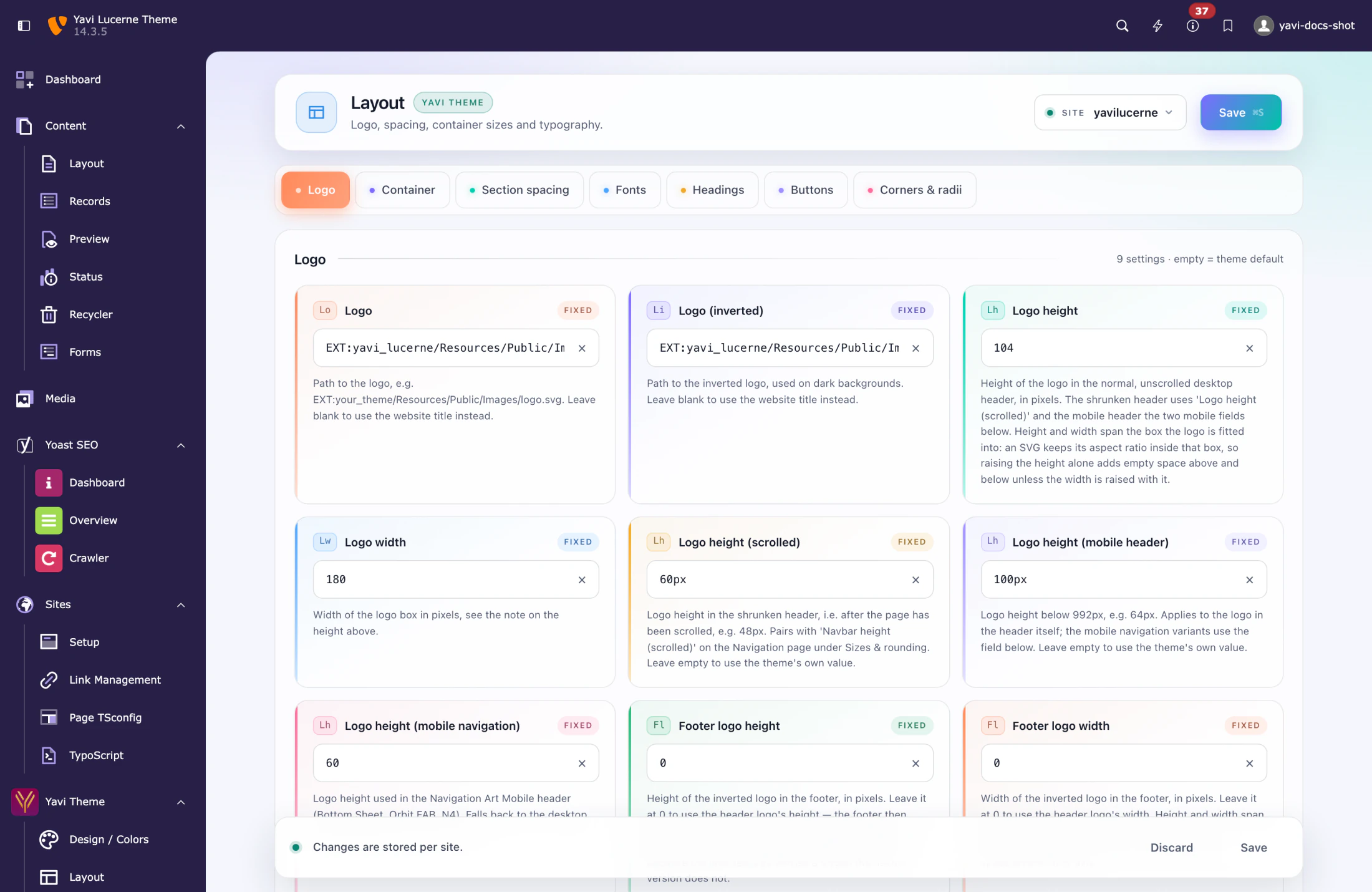
Everything about the logo is here — the two files and every height it takes on the way from a wide desktop header to a phone.
| Field | Note |
|---|---|
| Logo | Path to the logo file, e.g. EXT:yavi_lucerne/Resources/Public/Images/logo.svg or fileadmin/… |
| Logo (inverted) | Used on dark backgrounds — the transparent header over a hero image, the footer |
| Logo height | Height in the normal, unscrolled desktop header |
| Logo width | Width of the box the logo is fitted into |
| Logo height (scrolled) | Height in the shrunken header, once the page has been scrolled |
| Logo height (mobile header) | Height below 992px, in the header itself |
| Logo height (mobile navigation) | Height in the Navigation Art Mobile header — Bottom Sheet, Orbit FAB, N4. 0 follows the desktop Logo height. |
| Footer logo height | Height of the inverted logo in the footer. 0 follows the header. |
| Footer logo width | Same for the width |
The first two are file paths, not uploads. Put the file in fileadmin/ and reference it.
Height and width span a box, they do not stretch the logo. An SVG keeps its aspect ratio inside that box, so raising only the height adds empty space above and below instead of making the logo bigger. Raise both.
Logo height (scrolled) only does something with Fixed Navigation Transition switched on — that switch is on the Navigation page, under Behaviour.
Tab: Container (3 fields)
| Field | Meaning |
|---|---|
| Container max width | Width of the normal content column, e.g. 1320px |
| Wide container side padding | Side padding of the container-80 variant, e.g. 12vw |
| Content block gap | Vertical gap between the blocks inside one content element, e.g. 3rem |
Tab: Section spacing (5 fields)
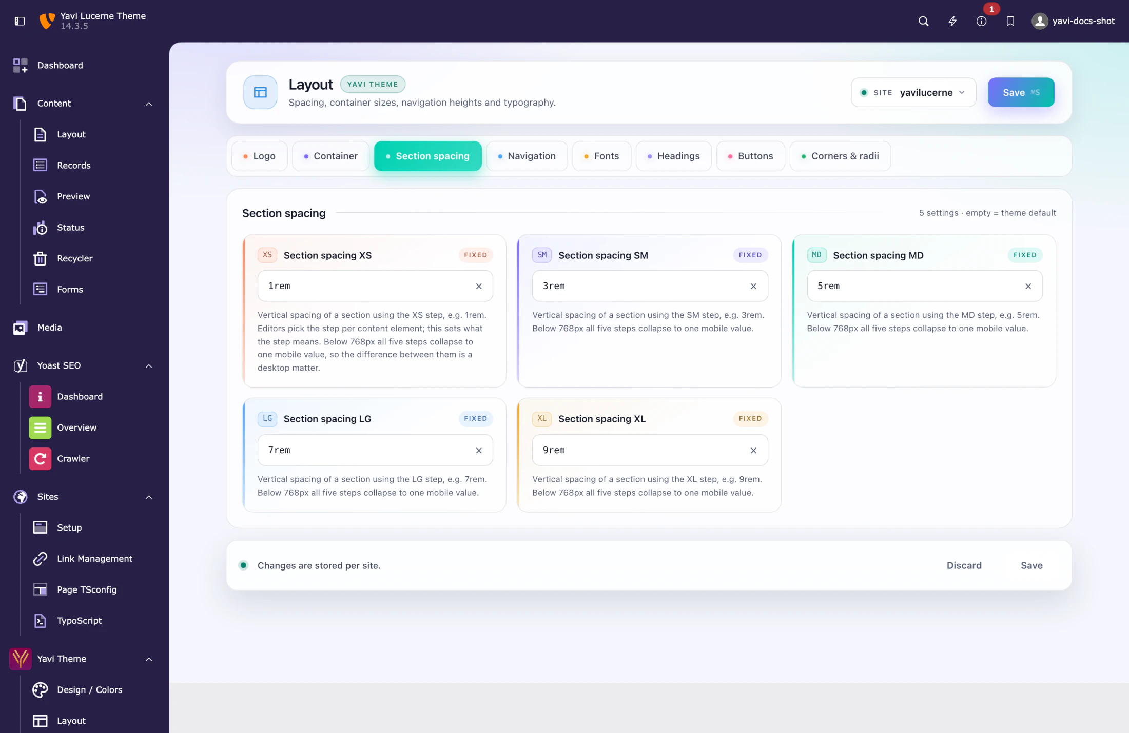
The five steps XS · SM · MD · LG · XL that editors pick per element as space before / space after.
| Step | Core default |
|---|---|
| XS | 1rem |
| SM | 3rem |
| MD | 5rem |
| LG | 7rem |
| XL | 9rem |
These are the only Layout fields with a non-empty core default, because a spacing scale with holes in it is worse than one that is merely not yours.
Tab: Fonts (5 fields)
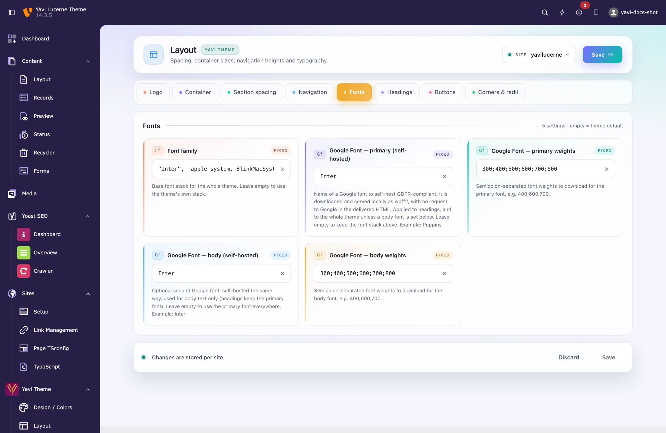
| Field | Meaning |
|---|---|
| Font family | The full CSS font stack for the site |
| Google Font — primary (self-hosted) | Family name, e.g. Inter. Downloaded and served from your own server. |
| Google Font — primary weights | e.g. 400;600;700 |
| Google Font — body (self-hosted) | A second family for body text, if it differs |
| Google Font — body weights | as above |
The Google fonts are self-hosted: the family is downloaded once, cached, and delivered from your domain. No request goes to Google at page view time, which is what makes the feature usable under the GDPR.
Only request the weights you actually use. Every weight is a file the visitor downloads.
Tab: Headings (7 fields)
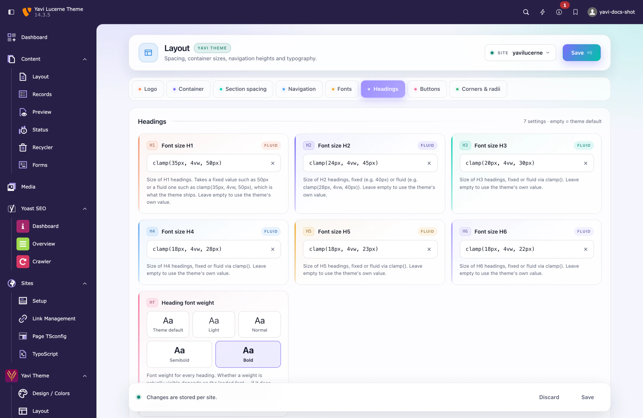
Font sizes H1–H6 plus the heading weight.
Sizes accept a fixed value (50px) or a fluid one (clamp(35px, 4vw, 50px)) — the badge next to the field tells you which kind is currently set. Fluid is the better default: one value that works from phone to desktop.
Heading font weight is a picker with four steps — Light (300), Normal (400), Semibold (600), Bold (700) — each shown in its own weight. Whether a weight is visible depends on the loaded font: if the family does not carry the cut, the browser picks the nearest one and Light looks like Normal. That is why the picker shows samples instead of numbers.
Tab: Buttons (5 fields)
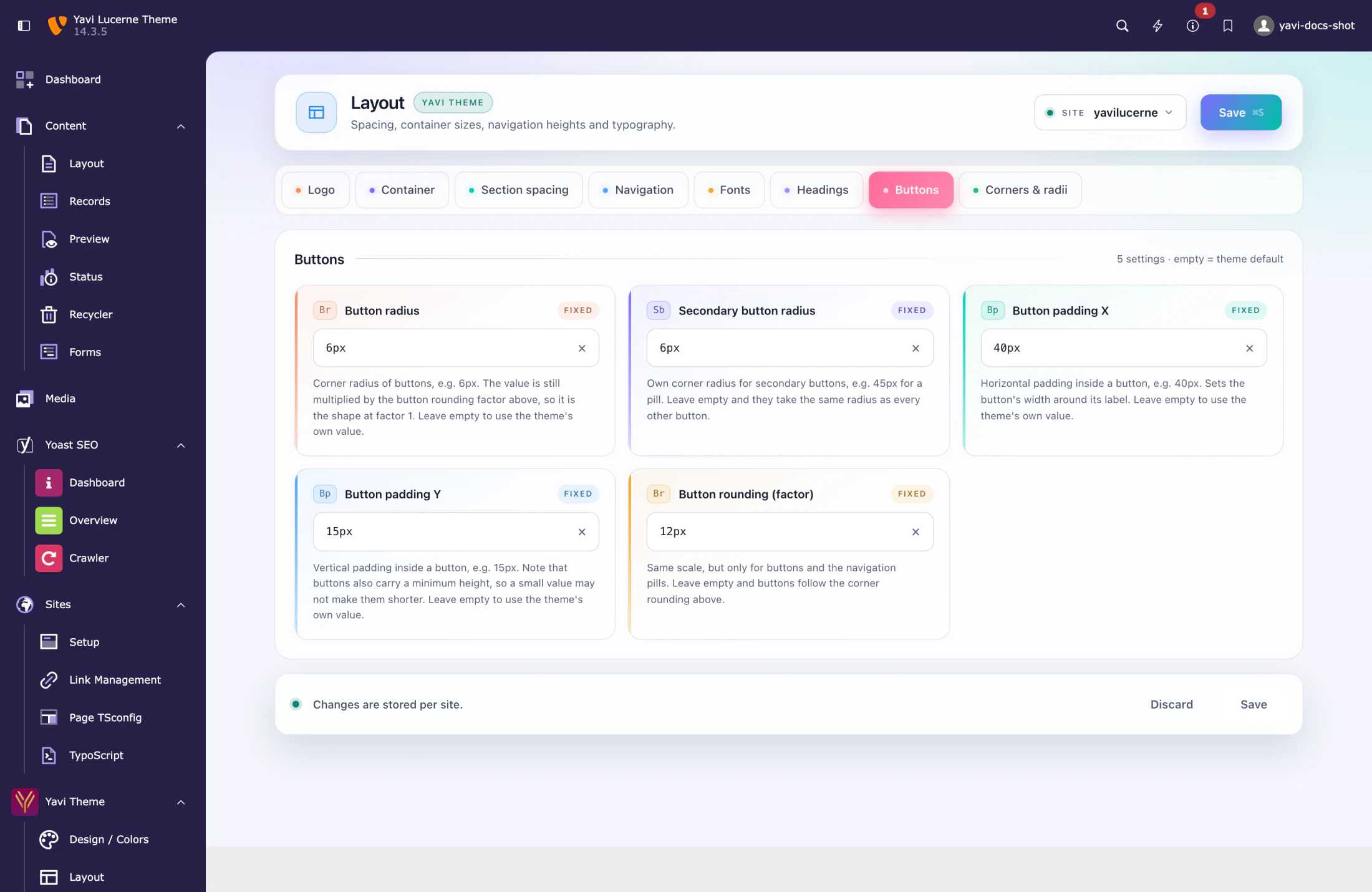
| Field | Meaning |
|---|---|
| Button radius | Corner radius of the primary button |
| Secondary button radius | Same for the secondary button |
| Button padding X | Horizontal padding, e.g. 40px |
| Button padding Y | Vertical padding — note that buttons also carry a minimum height, so a small value may not make them shorter |
| Button rounding (factor) | A multiplier, not a length |
Tab: Corners & radii (3 fields)
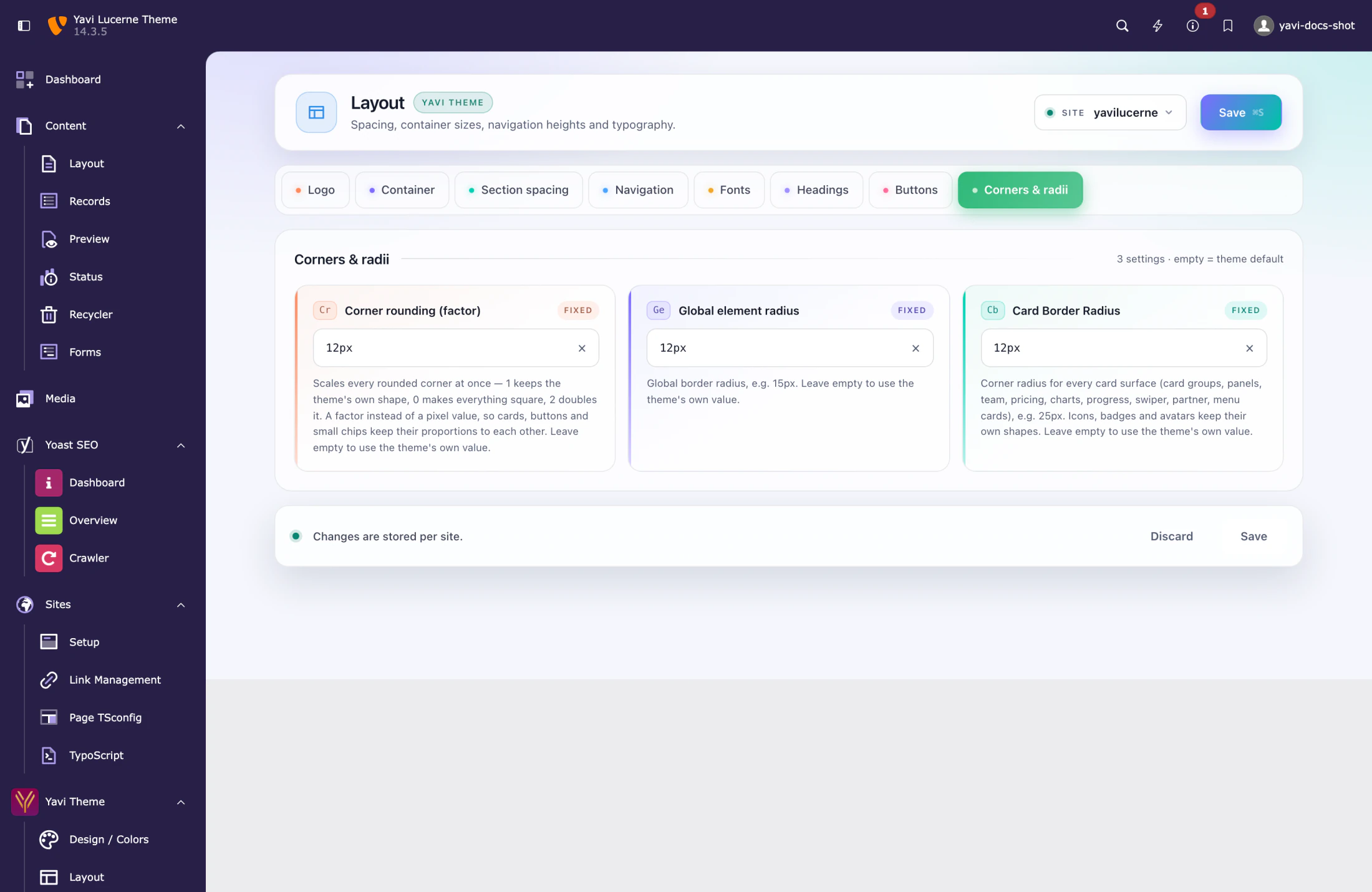
| Field | Meaning |
|---|---|
| Corner rounding (factor) | Scales every rounded corner at once |
| Global element radius | Bootstrap's base radius, e.g. 15px |
| Card Border Radius | Every card surface: card groups, panels, team, pricing, charts, progress, swiper, partner, menu cards |
Factor or length — the one mistake to avoid
Two fields on this page take a factor, not a length:
- Corner rounding (factor)
- Button rounding (factor)
1 keeps the theme's shape, 0 makes everything square, 2 doubles it. They are factors because cards, buttons and chips should keep their proportions to each other.
Entering 12px in a factor field does nothing: a length there would produce calc(28px * 12px), which is not a valid CSS length, so the value is discarded and the theme's shape stays. If you want 12px corners, use Global element radius or Card Border Radius — the length fields.
Length fields, by contrast, are forgiving: 12 and 12px both work.
Per-element radii
Card items have their own Card radius field with four corners and a chain symbol: linked, one value changes all four; unlinked, each corner is set on its own. Leave it empty and the card follows the site's Card Border Radius.