
12 — Content elements
63 content element types are available with the theme active. Two of them are Yavi's own (CTA and Portfolio); the rest come from TYPO3 and Bootstrap Package and are reworked by the theme — new layouts, new fields, its own templates. On top of that, every element gains a set of shared fields.
This chapter covers what is new. A complete list of types is in the content element reference.
Fields every element gets
Whatever type you pick, these fields are available. They are the reason a Yavi page looks composed rather than assembled.
Headline area
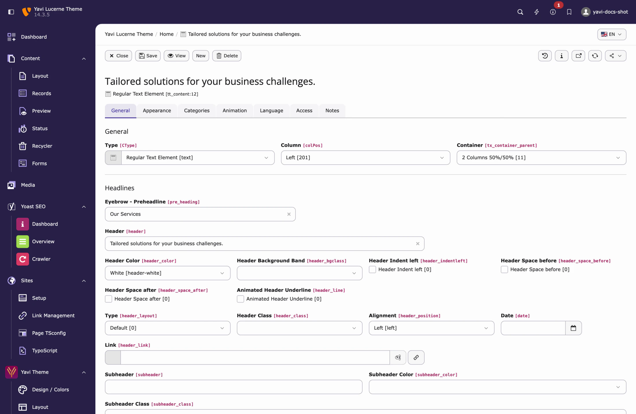
| Field | What it does |
|---|---|
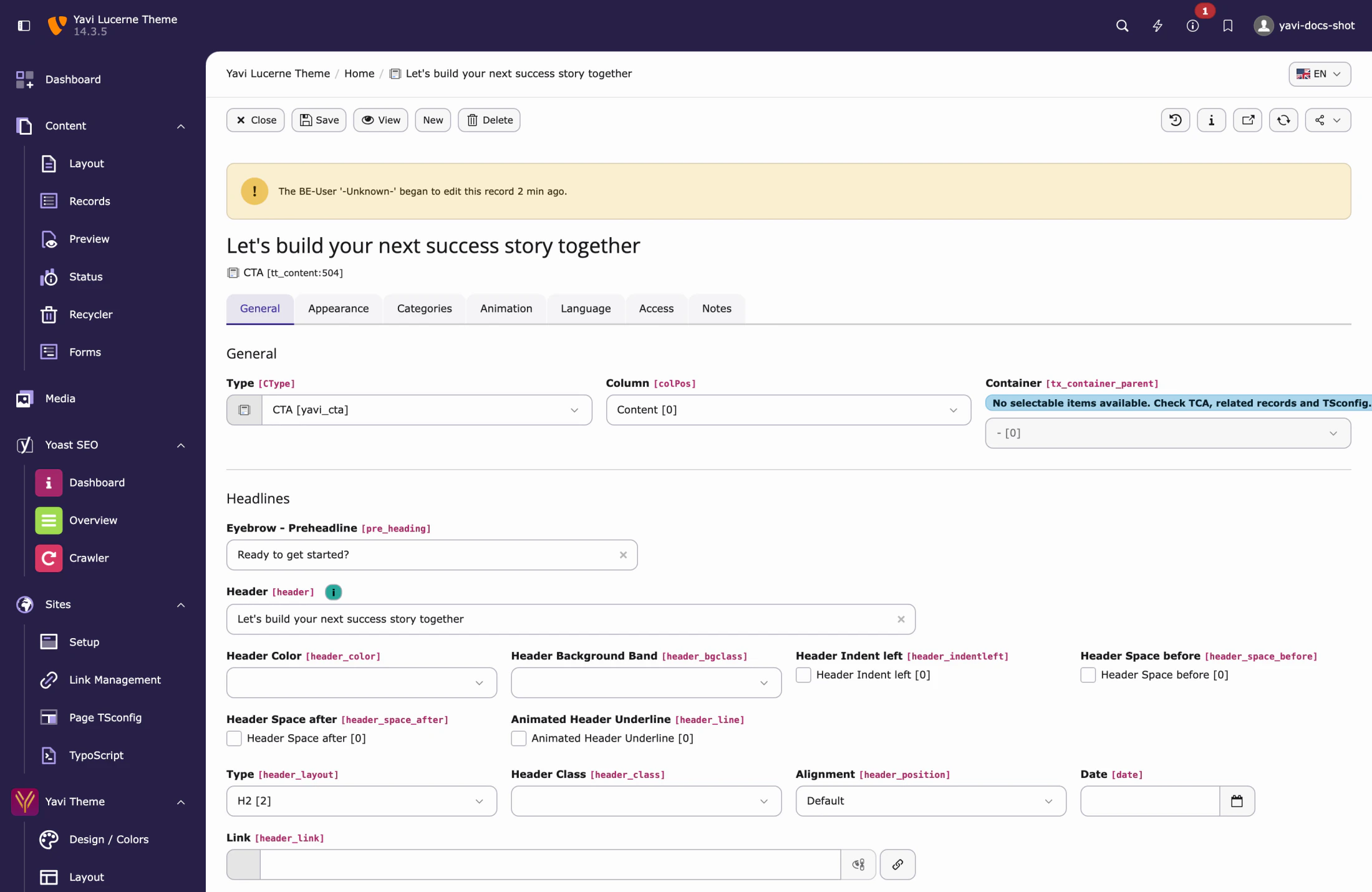
| Eyebrow – Preheadline | Small line above the headline, usually uppercase, with a short rule under it |
| Header Color · Subheader Color | Colour for headline and subheadline |
| Header Background Band | Puts the headline on a coloured band (primary, secondary, white, black) |
| Header Indent left | Indents the headline |
| Header Space before / after | Space around the headline, independent of the element spacing |
| Animated Header Underline | The rule under the headline draws itself when scrolled into view |
Headline syntax
Square brackets mark words inside a headline:
Building business [with purpose]The bracketed words take the Headline word color from Design / Colors. The same syntax works in the carousel headline and on card headings.
Text
| Field | What it does |
|---|---|
| Text Color | Colour of the body text |
| Text width | Width of the text area in Bootstrap columns — a full-width element with a half-width text column is the most common editorial layout |
| Text position | Left, centred, right within the row |
Icon
| Field | What it does |
|---|---|
| Content Icon | An icon from the icon set, or an uploaded SVG |
| Icon Color | Colour of the icon |
| Icon position | Above, right of, below or left of the text |
The icon's alignment follows the text alignment; it is not a separate decision. When no icon is set, the layout is untouched — no reserved space, no gap.
Buttons (Content Link)
Elements can carry any number of buttons, each with:
| Field | Note |
|---|---|
| Link | Any TYPO3 link: page, file, external, e-mail |
| Linktext | Falls back to "Read more" when empty |
| Button Color | Primary, secondary, … |
| Position | Where the button row sits |
Frame
| Field | What it does |
|---|---|
| Fixed Height | e.g. 800px, 100%, 80vh — for hero-like blocks |
| Frame Extra CSS-Class | A free class, for one-off cases |
| Custom CSS Classes | The multi-select fed by Custom CSS |
| Background image, gradient overlay | Background of the frame, with an optional gradient over it |
Visibility per device
| Field | Hides the element |
|---|---|
| Hide on Desktop | from 992px |
| Hide on Tablet | 768–991px |
| Hide on Mobile | below 768px |
This genuinely removes the element from the markup on that viewport instead of hiding it with CSS — an image not shown is an image not downloaded.
Animation
Animations are AOS-based and configured per part of the element: Header, Subheader, Eyebrow, Text, Button, Image, Icon, Main. Each takes an animation type, a delay and a mirror flag.
Two practical notes:
- The delay is what makes an element feel composed: eyebrow at 800 ms, headline at 950 ms, buttons at 1150 ms reads as one movement, not four.
slide-animations move the element by its own width and become visible the moment they start. Inside the carousel they are clipped horizontally so they cannot stick out of the page; elsewhere preferfade-, which moves a fixed 100 px and starts fully transparent.
The element families
Cards (Card Group)
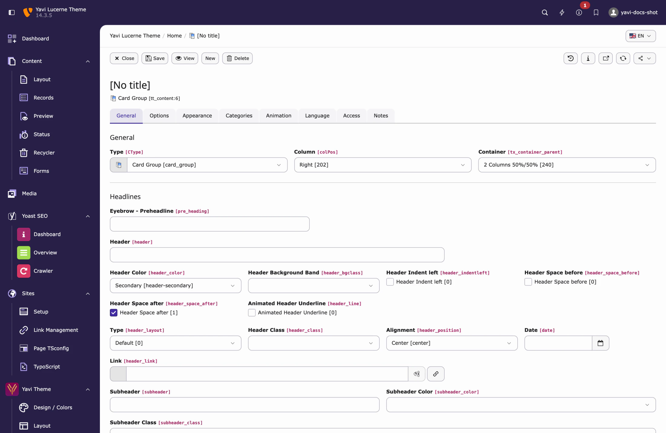
One element, twenty layouts. Each card is a record in the element, so editors re-order by dragging.
| Layout | Character |
|---|---|
| Simple · Card Left · Card Simple Left | Text card, image optional |
| Backgroundimage | Image fills the card, text on top |
| Service | Icon, headline, text — the classic three-column service row |
| Card Video | Card with a video |
| Card Counter | Counts up to a number when scrolled into view |
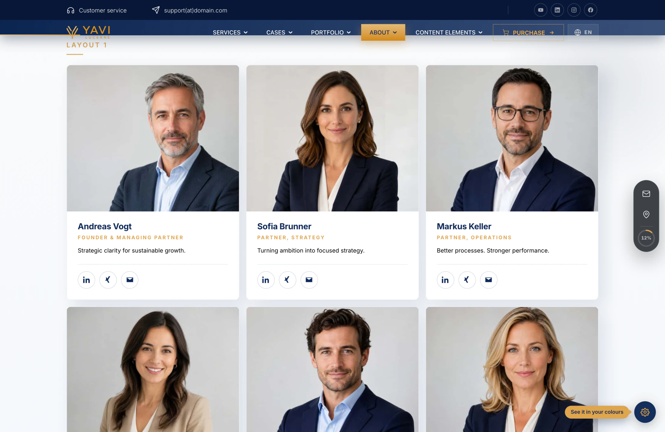
| Card Team | Portrait, role, social links |
| Card Links | A list of links inside the card |
| Card width Masonry | Masonry grid, uneven heights |
| Card Chart | Circular chart with a value |
| Card Hover | Content revealed on hover |
| Card Pricing | Price table with a highlighted plan |
| Card Partner | Logo grid |
| Card Casestudy | Reference teaser |
| Card Process | Numbered steps |
| Progress Bar | Bar with a percentage |
| Card News | News teaser |
| Card with Swiper | Cards in a slider |
Per card: headline, description, image, link with icon, badge text ("Most booked"), highlight flag, background and text class, and its own four-corner radius.
The card item
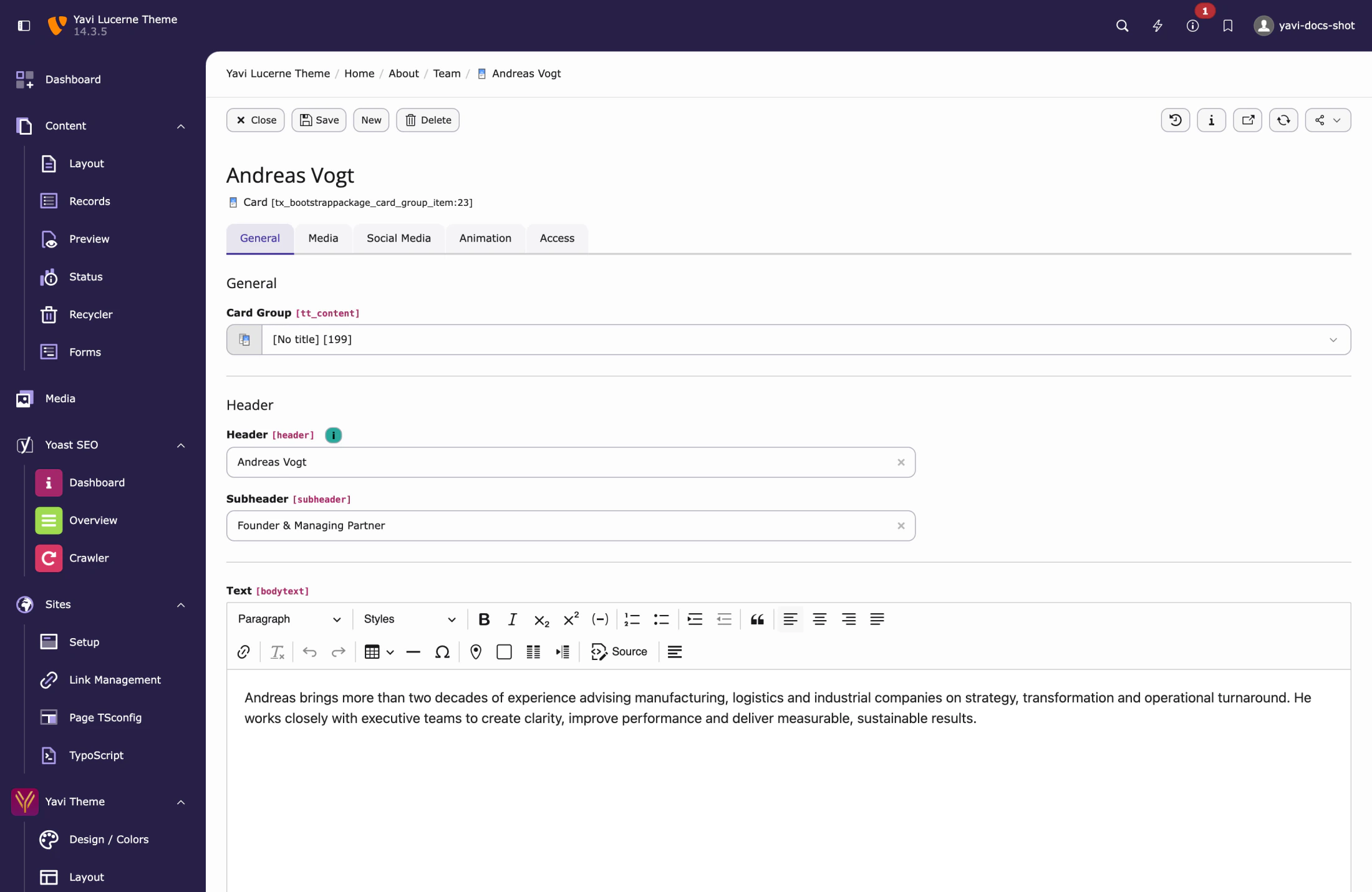
Per element: columns per breakpoint, autoplay interval and speed for the slider layouts, navigation on/off, chart colours and sizes.
Carousel
Three elements — Carousel, Carousel Small, Carousel Fullscreen — sharing one slide table. This is the largest element in the theme; it has its own chapter: 13 — Hero and carousel.
CTA (yavi_cta)
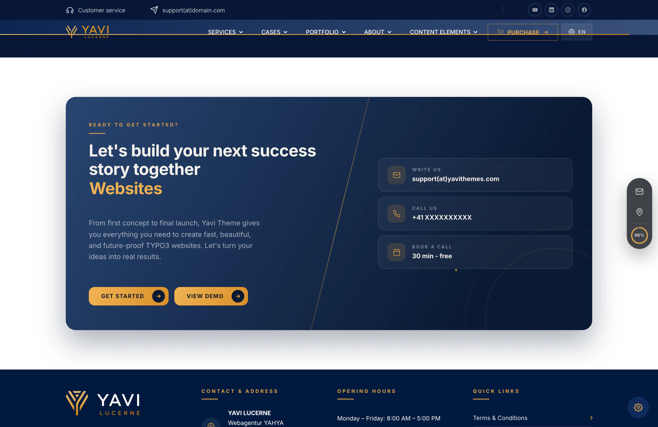
A call-to-action banner with eyebrow, headline, rotating words, buttons and a free-form info row (phone, e-mail, opening hours). Three layouts:
| Layout | Character |
|---|---|
| Aurora Panel | Full-bleed, animated background |
| Split Card | Text next to contact chips |
| Panel | Headline, buttons, contact row |
The rotating headline words are entered as one field separated by semicolons; they cycle next to the headline, above or below it, with a horizontal, vertical or fade animation.
Portfolio (yavi_portfolio)
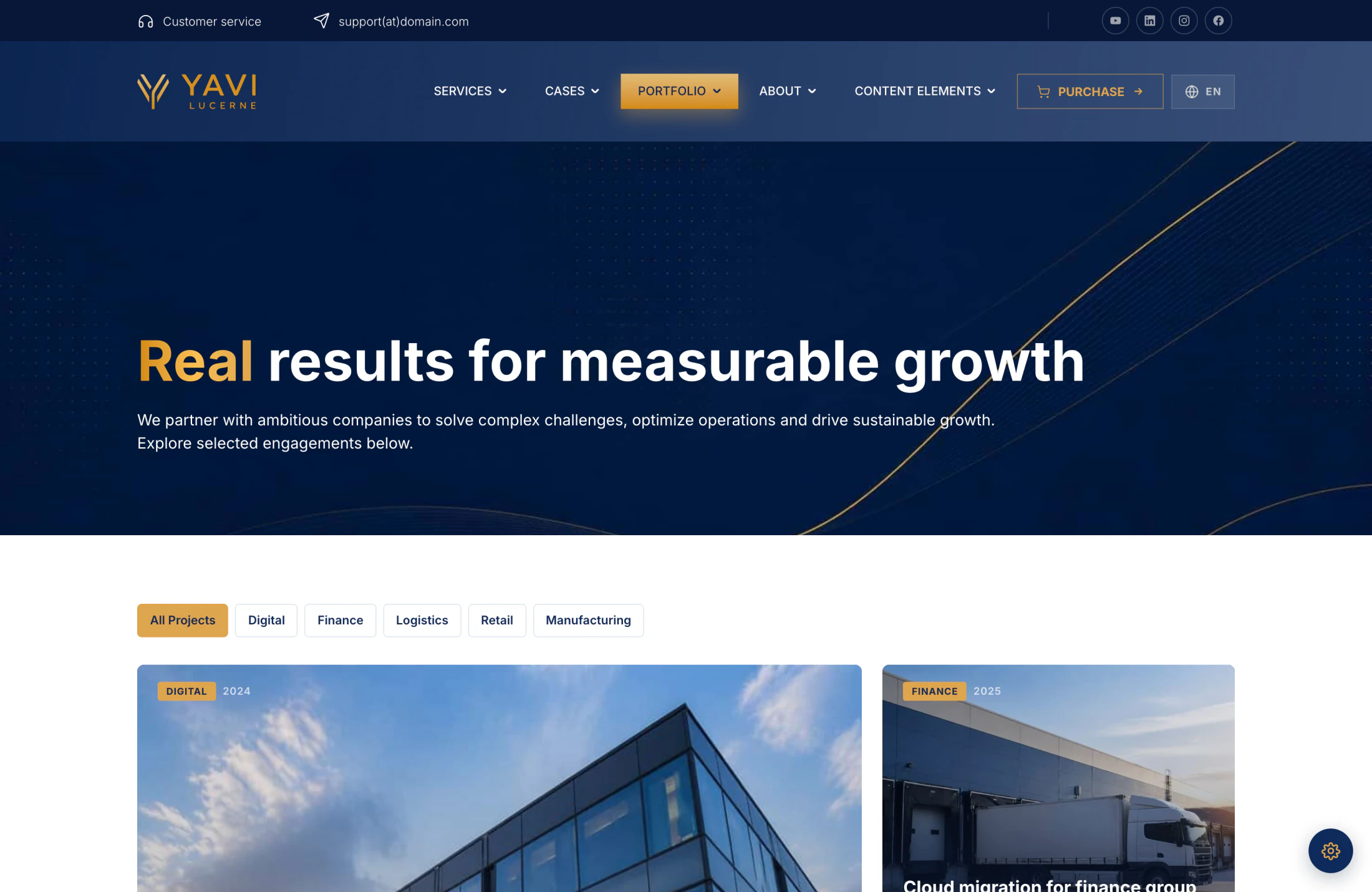
Project showcase with three layouts: masonry grid, featured hero + grid, and sidebar filter + grid. Each project has a title, subtitle, description, year, link and image.
Project Facts (yavi_panel_facts)
A structured label/value list — for project data, key figures or technical specifications.
Quote
Six layouts: gold card, navy split with portrait, minimal editorial, light card, photo split, dark centred portrait. Each with the quoted person's name, role and optional portrait.
Tab
Tabs in three layouts: gold underline, pills, vertical.
Media, Gallery, Audio, Video
| Element | Note |
|---|---|
| Media | Two layouts: card grid, or featured item plus list |
| Gallery | Grid with optional masonry, image comparison slider |
| Audio | Two players: hero player and compact list. Reads duration from the file. |
| Video | Own player skin with poster, loop and controls; or an external media embed (YouTube, Vimeo) |
Icon Group
Four layouts: sticky bar, icon list, topbar, swiper. Used for the topbar's contact icons and for feature rows.
Containers
Multi-column containers (1, 2, 3, 4 columns and asymmetric 4/8, 8/4 grids) plus Modal and Offcanvas containers, whose content opens in a dialog or a slide-in panel.
Backend preview
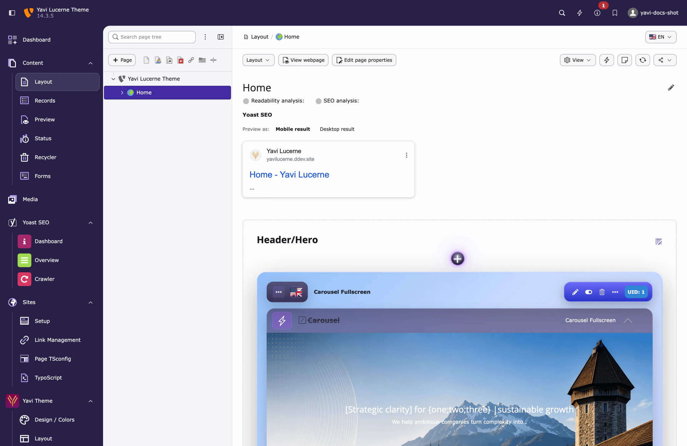
Most elements render a real preview in the page module rather than a grey box — cards show their cards, carousels their slides, the CTA its layout. If an element shows only its header, no preview renderer is registered for that type; that is a gap, not a failure.